Industry:
Florist business,
Technology
Role
Ux Designer
Visual Designer
Timeline
March-May 2025
Tools Used
Miro
Figma
Overview
The Product:
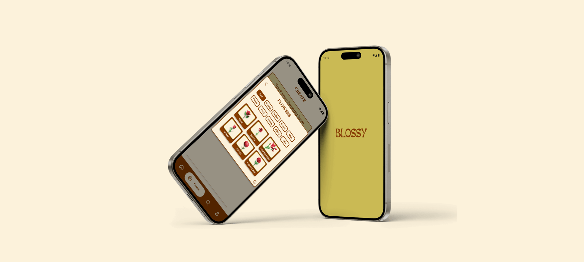
This self-initiated project is an innovative app designed for both beginner and professional florists, aimed at enhancing their daily workflow and helping them grow their business.
My role:
As a UX Designer, I led user research, developed personas, created wireframes and prototypes, conducted usability testing, and refined the final interface. I was also responsible for building the brand concept, including logo design, branding, typography, and color palette.
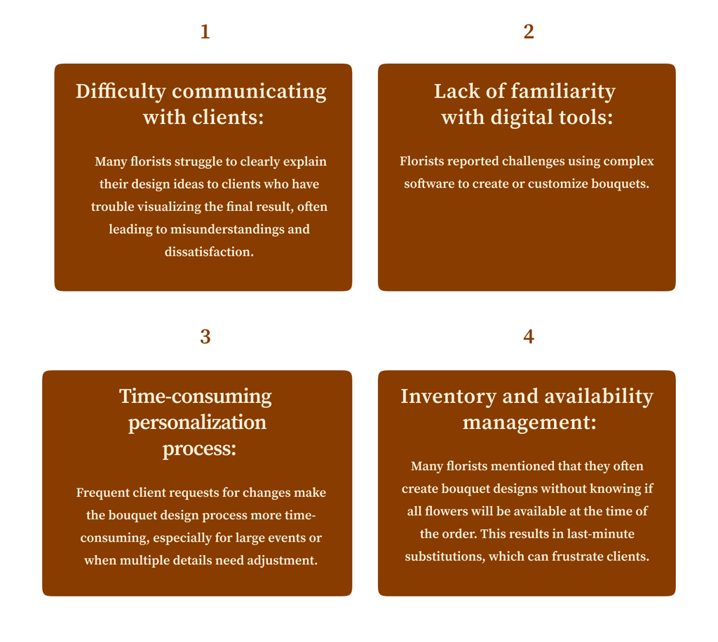
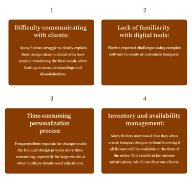
Florists may not feel efficient or profitable and struggle to improve sales in their business. They lack access to a simple platform that simulates bouquet arrangements and brings more practicality to their daily sales, inspiring them to feel more confident.
The problem:
The goal:
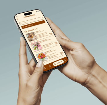
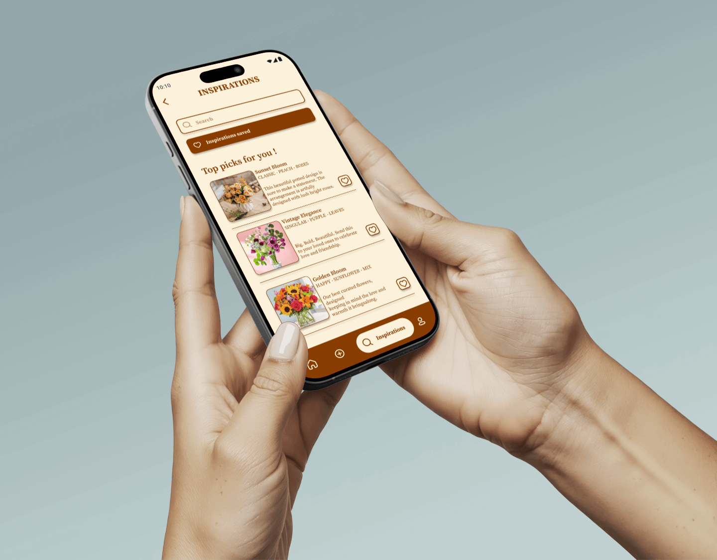
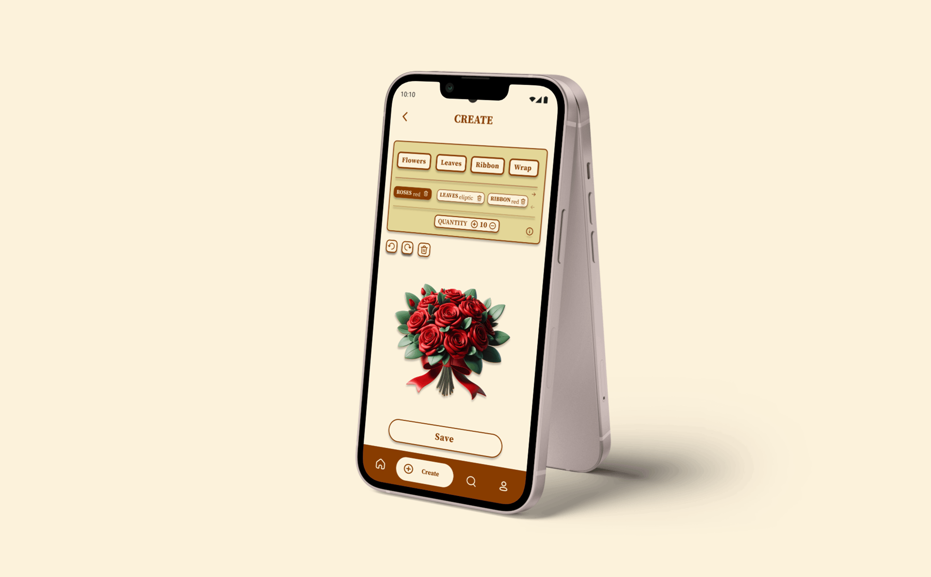
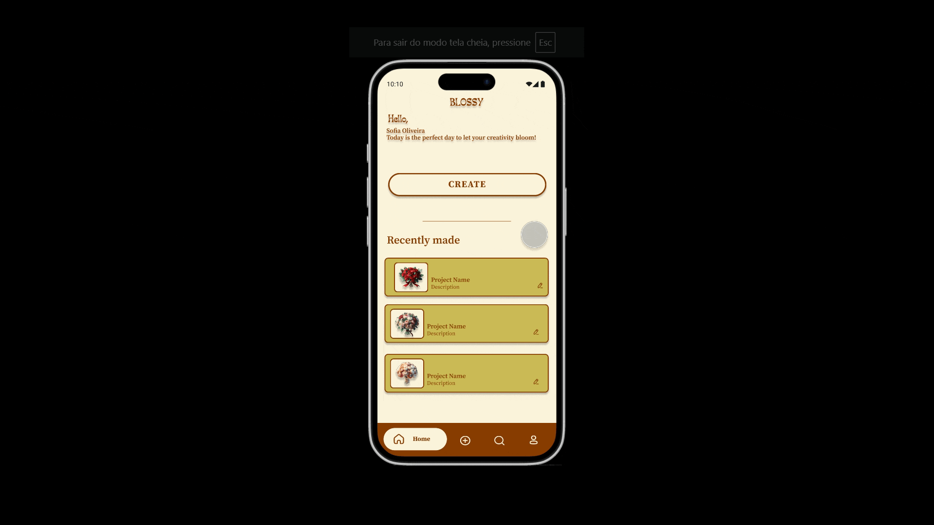
A flower bouquet simulation platform with optional features to organize by clients and delivery dates, along with a daily inspiration channel for bouquet ideas, helping florists with more references and creative input for their work.
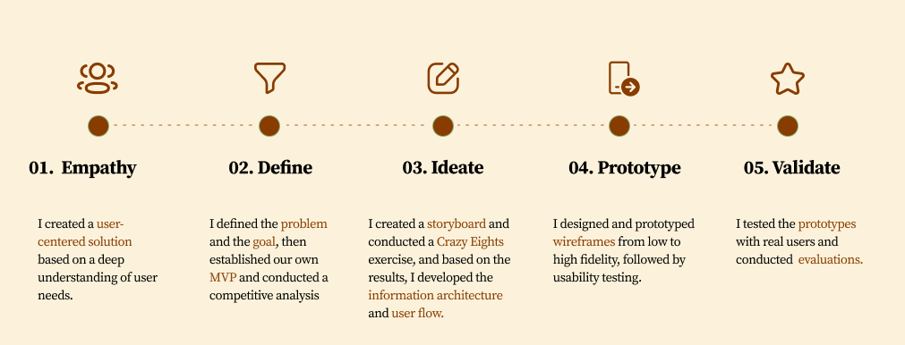
Design Process
01. Guided by empathy, I explored florists’ emotions to reveal the beauty and challenges behind their craft.
02. Define
To better understand the needs and challenges of florists, I conducted interviews and created empathy maps to gain insights into the users I was designing for and their needs. Initially, I assumed that all florists prioritized creativity over efficiency and had similar levels of comfort with digital tools. However, during the research, I identified two distinct user groups: beginner florists like Sofia, who focus on quick and straightforward solutions to build their brand, and experienced florists like João, who require advanced customization features to serve high-end clients. This insight shifted my approach, leading me to design a tool that balances simplicity for newcomers and robust features for seasoned professionals.
User research:
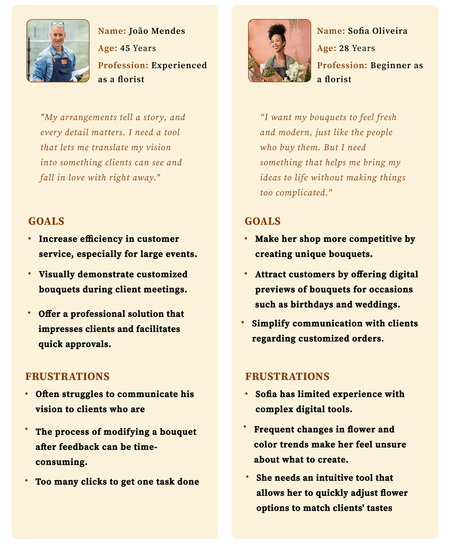
Personas
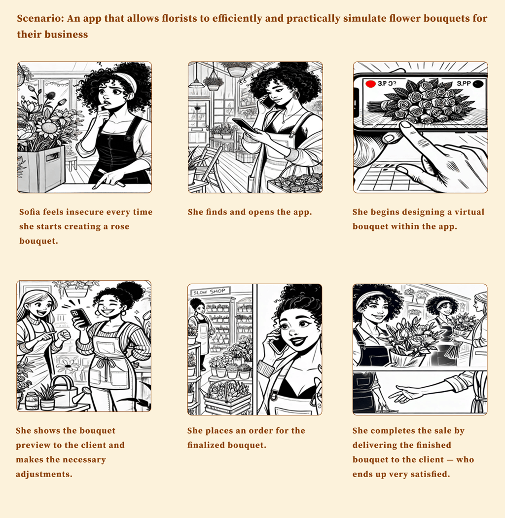
Storyboard
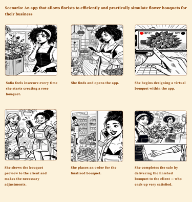
We illustrated Sofia’s storyboard while she explores the use of an app designed to enhance her daily work routine
03. Ideate
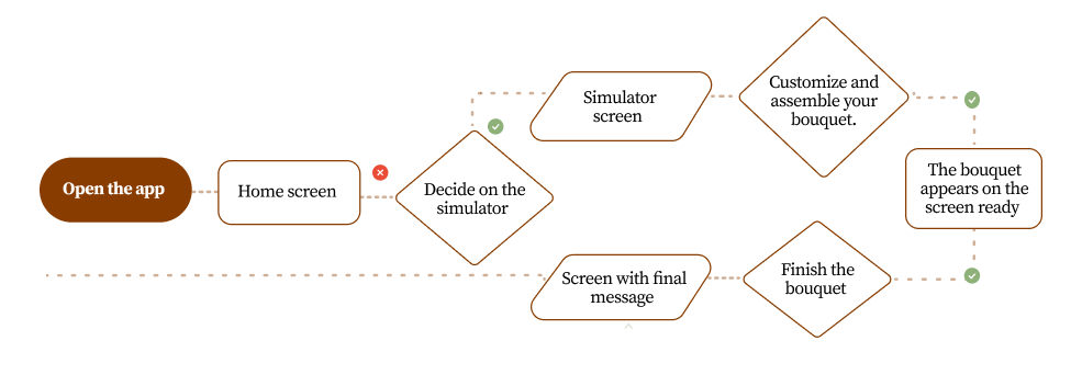
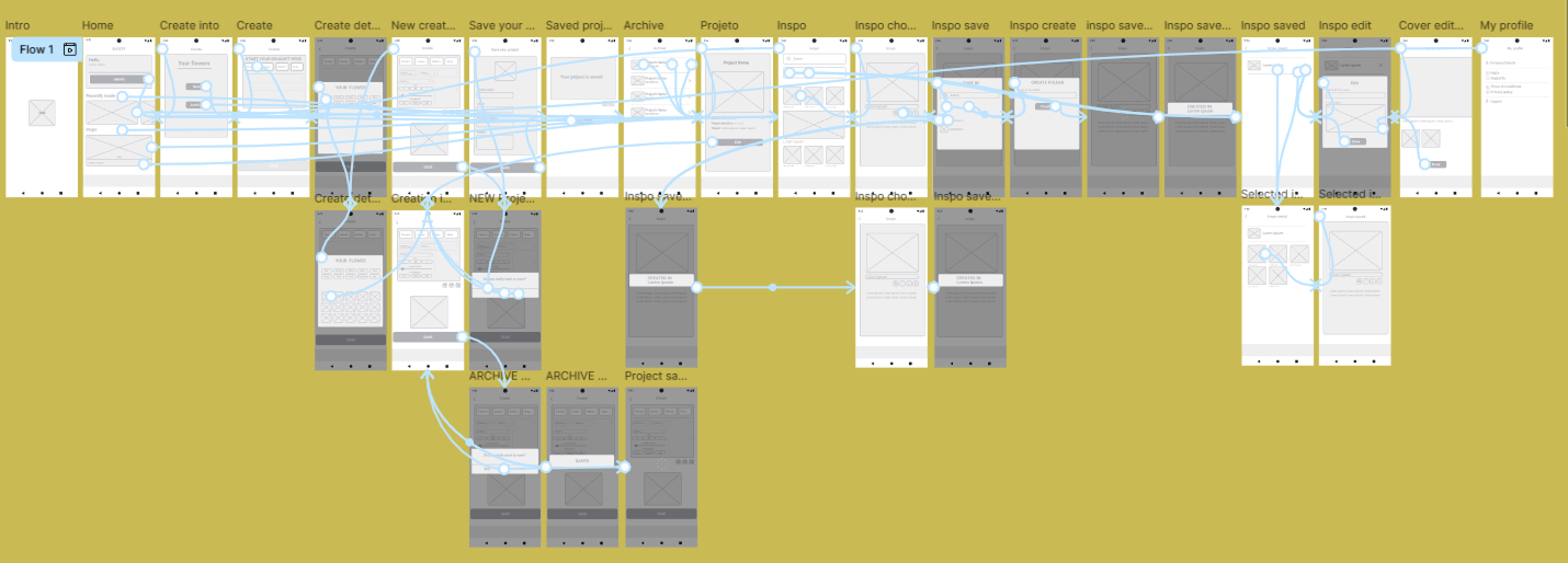
User flow
Simulate flower bouquets to be more competitive in sales
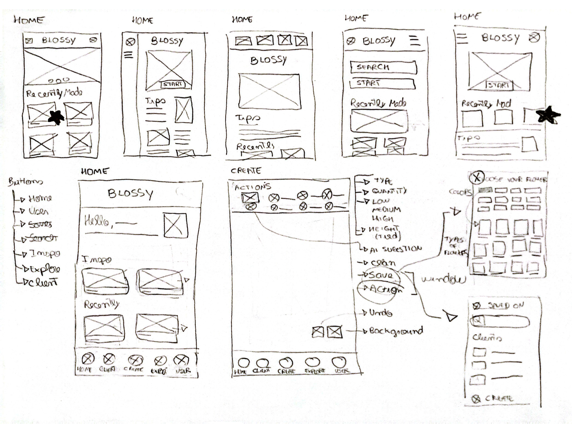
Paper wireframes
I began the process with paper sketches to explore different layouts and navigation flows before digitizing them. The focus was on ensuring simplicity and accessibility.
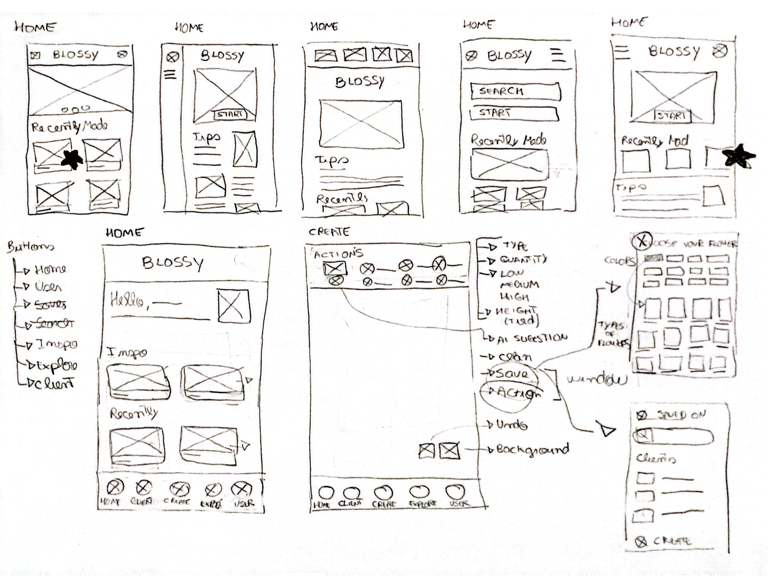
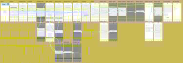
Digital wireframes
04. Prototype
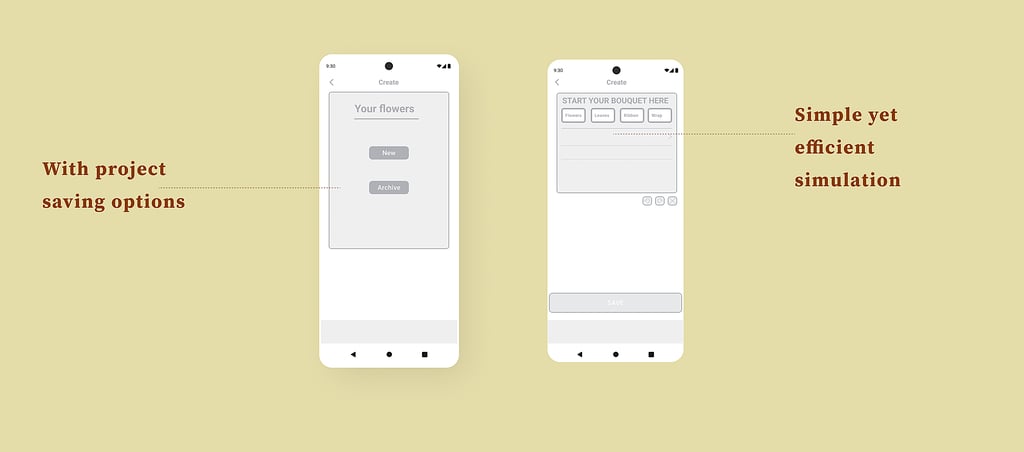
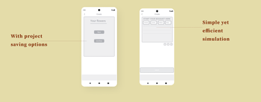
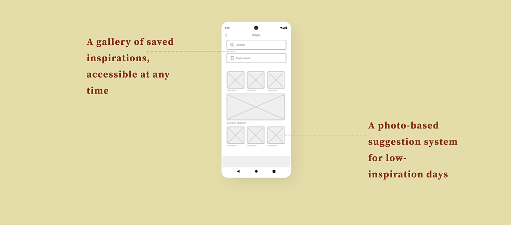
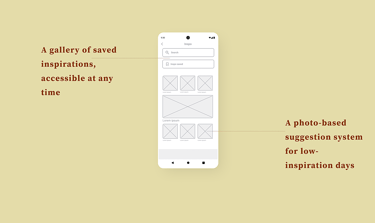
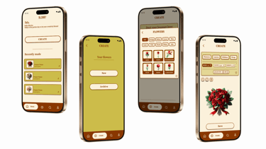
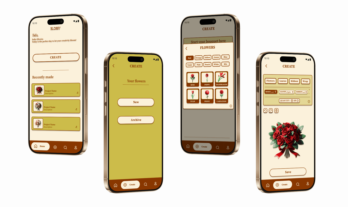
The digital wireframes were created in Figma to define the structure of the app. Structuring key interface sections like Bouquet Creation, Archiving, and Inspiration Feeds
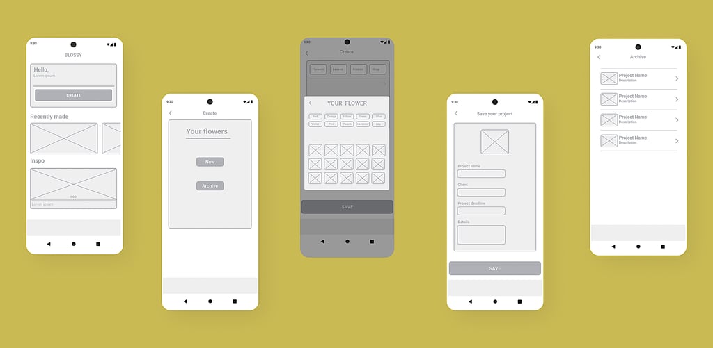
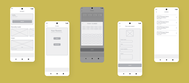
Low-fidelity prototype
The digital wireframes were created in Figma to define the structure of the app. Structuring key interface sections like Bouquet Creation, Archiving, and Inspiration Feeds
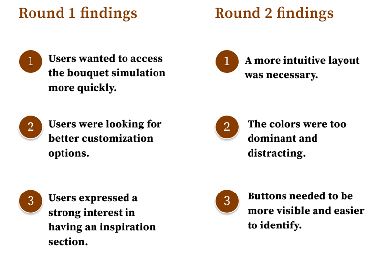
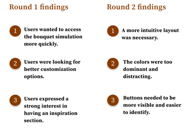
05. Validate
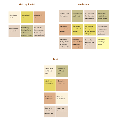
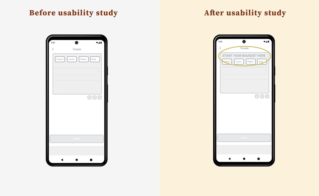
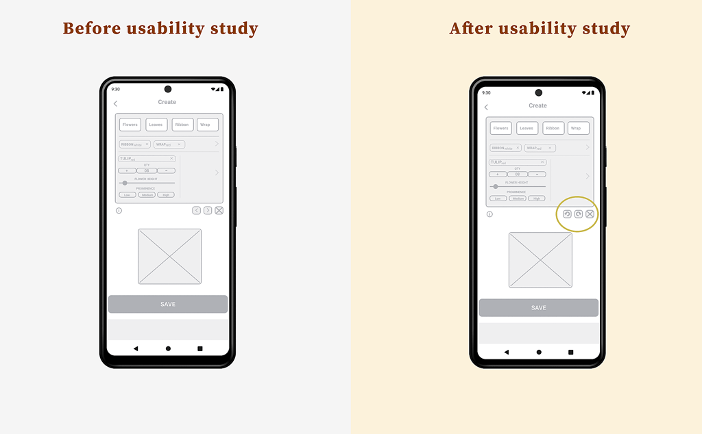
We conducted usability tests with five users to evaluate ease of use. It was discovered that some buttons were not easily visible, so we adjusted the design to improve accessibility
Usability study:
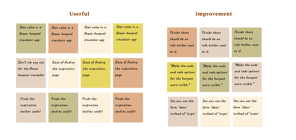
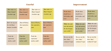
Affinity Diagramming

Changes
Based on the feedback from the tests, we refined the interface, optimizing the task creation flow to reduce the time needed to complete an action
The replaced buttons are commonly used in other apps, which is why they will be more easily accepted.
Style guide
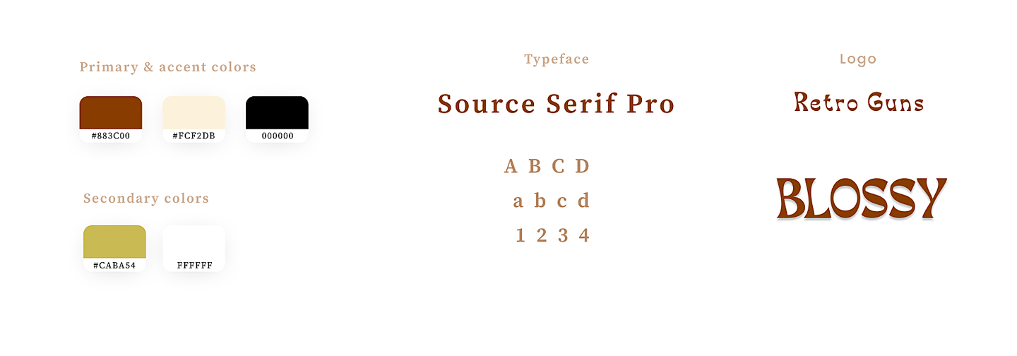
I chose a bright and visually pleasant color palette, along with a readable font, since the app will be used on phones of all sizes.
Accessibility considerations
1- Enlarging the screen and changing the font size are also options that can be performed by the application;
2- The application's navigation menu was developed with the presence of both icons and words to facilitate accessibility;
3- Accessibility auditoriums were based on WCAG 2.1/2.2.
Takeaways
During the prototype testing, we received positive feedback from participants, who highlighted the ease of use and the improvement in productivity. The app was tested by 10 participants, with a satisfaction rate of 85%.
Impact
What I learned
Next Steps
This project taught me the importance of testing ideas quickly and listening to users from the beginning. I also learned that simplicity in design is essential to ensure a smooth and intuitive experience.
Refinement and Improvements Based on Feedback
Development of the MVP (Minimum Viable Product)
Testing and Launch Planning